Case Study: Wonder
Role
Lead Designer
Responsibilities
Event Brand Identity Creation, Style Guide, Collateral, Marketing Material
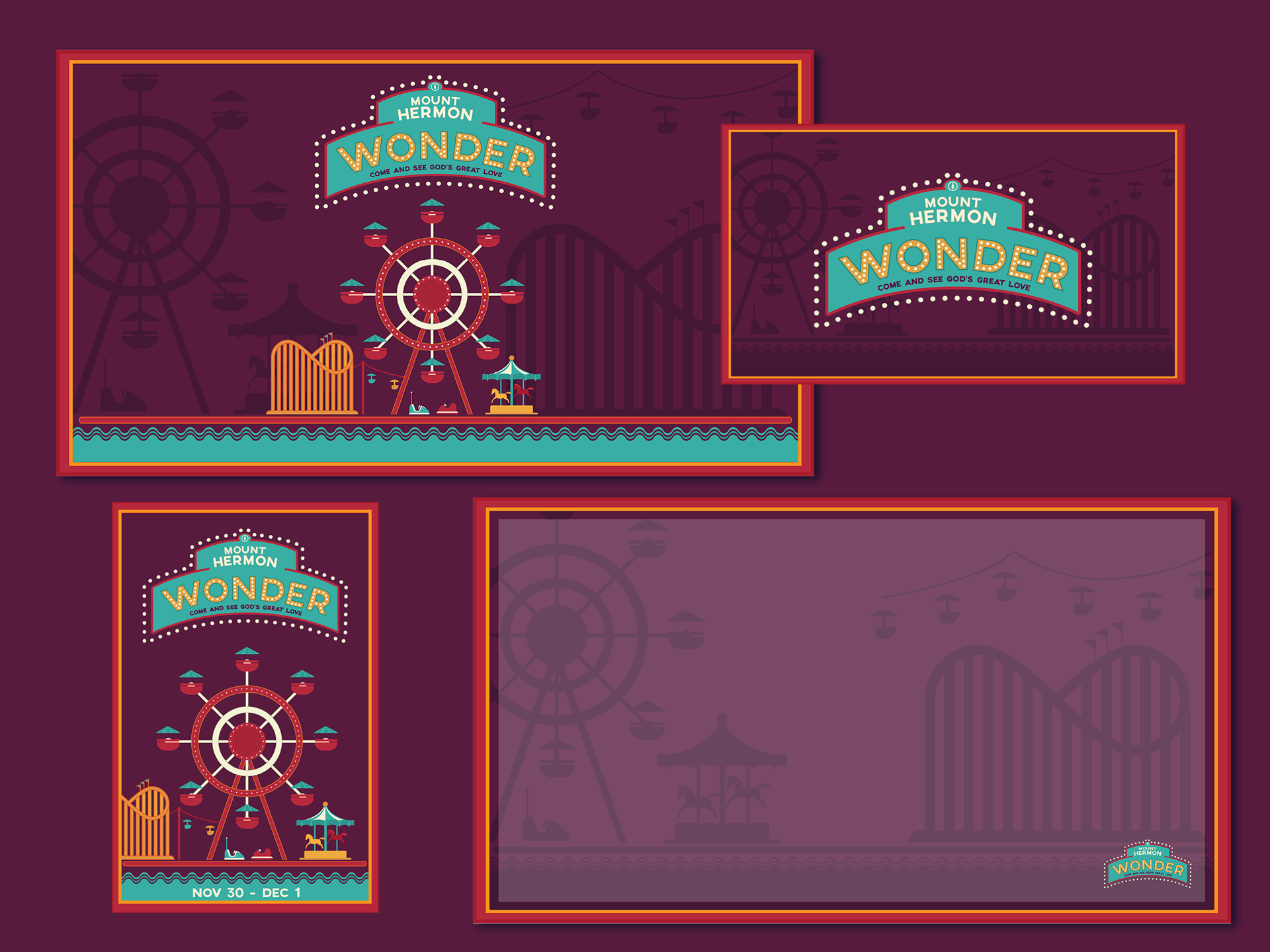
Media Kit. Includes: powerpoint slides, posters, web banners, social graphics
Outcome
Marketing material provided for 5000+ patrons, theme and messaging carried out for 2500+ students while being age appropriate. Thousands of dollars saved on setup costs, marketing material, and event expenses.
Problem Statement
To save on costs, the company switched from creating separate themes for their elementary and high school retreats to a combined theme. They wanted the look to be playful and friendly enough for a 12 year old, but not too childish for an 18 year old.
Audience
Youth Pastors, Older Elementary to High School students
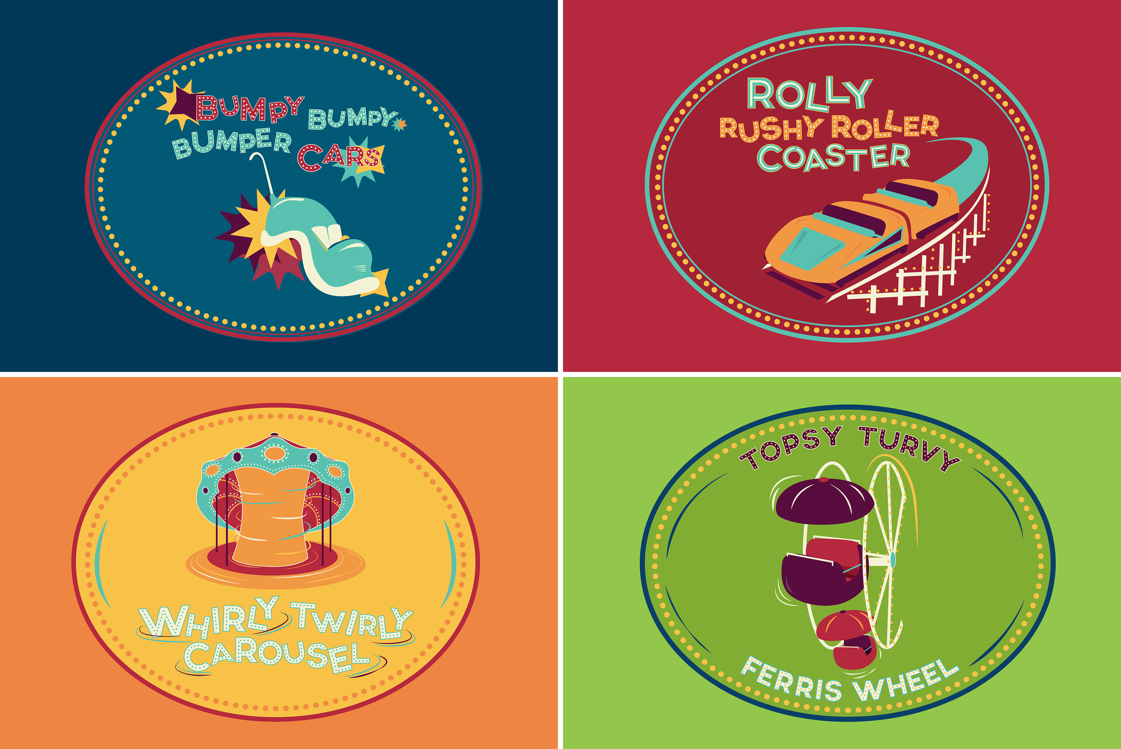
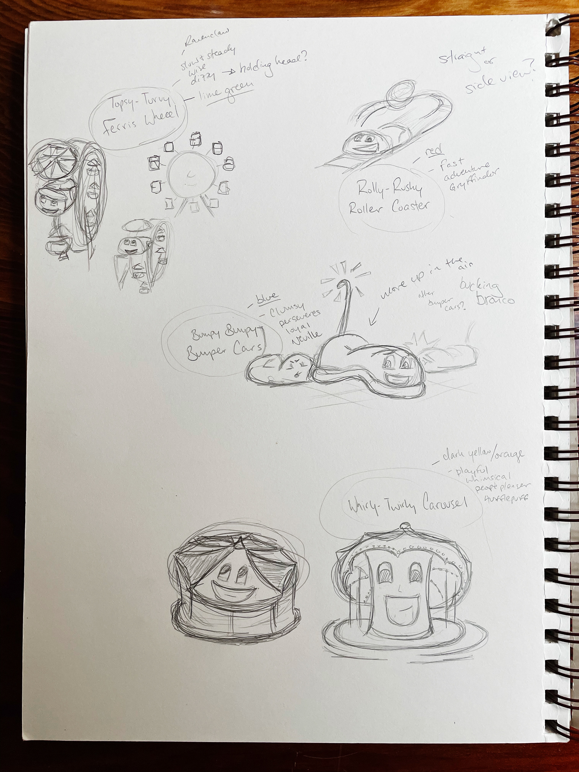
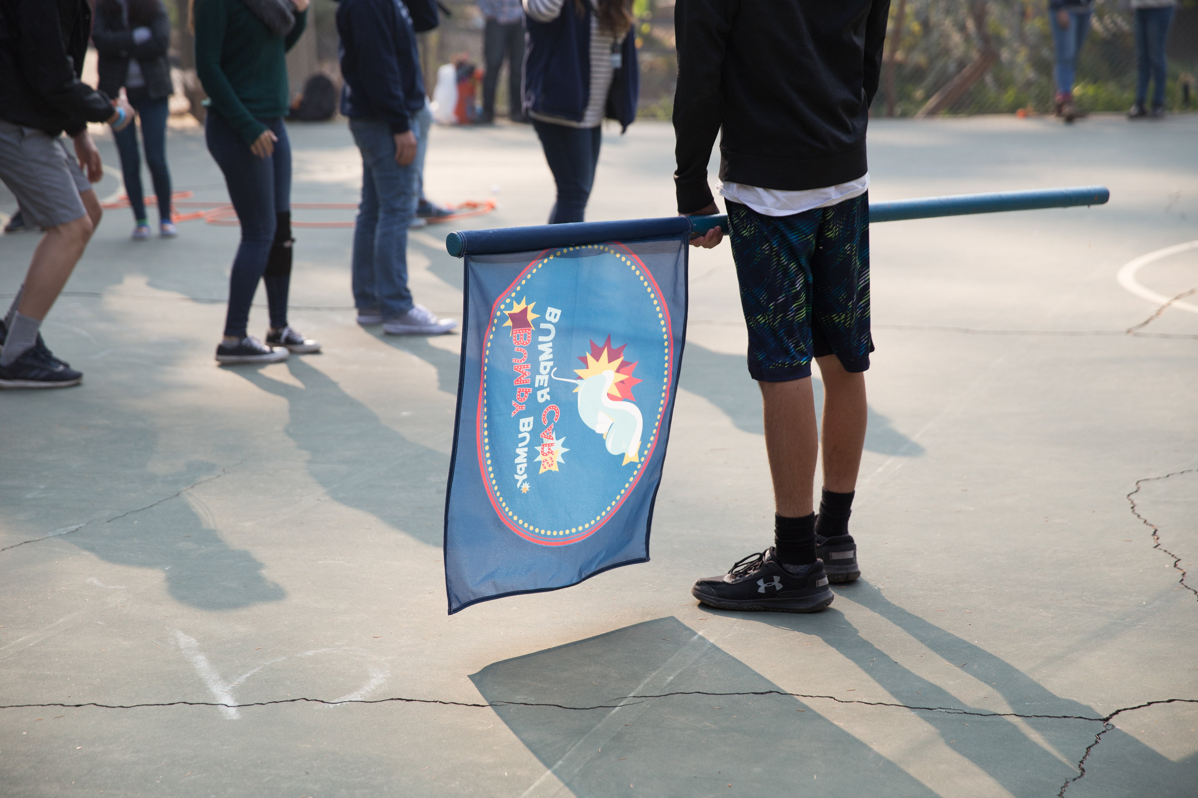
Team Logos developed with the idea of looking like a squashed penny
Approach
Understanding
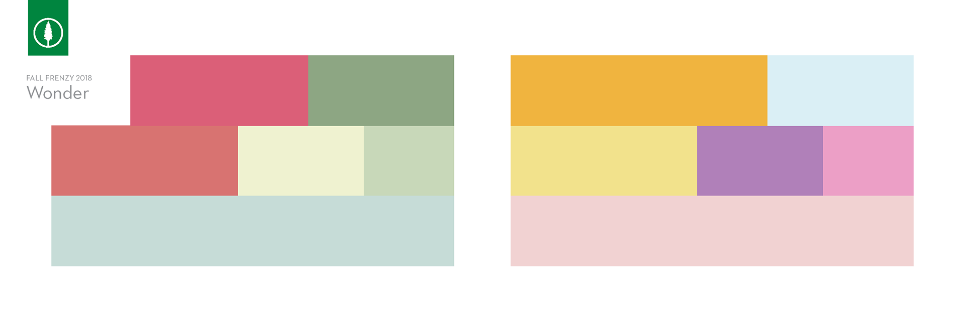
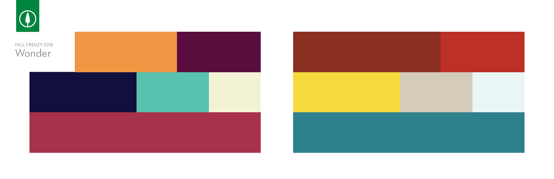
The design needed to be unisex friendly as well as age friendly. With that in mind, colors, shapes, and subject matter all needed to span the age gap.
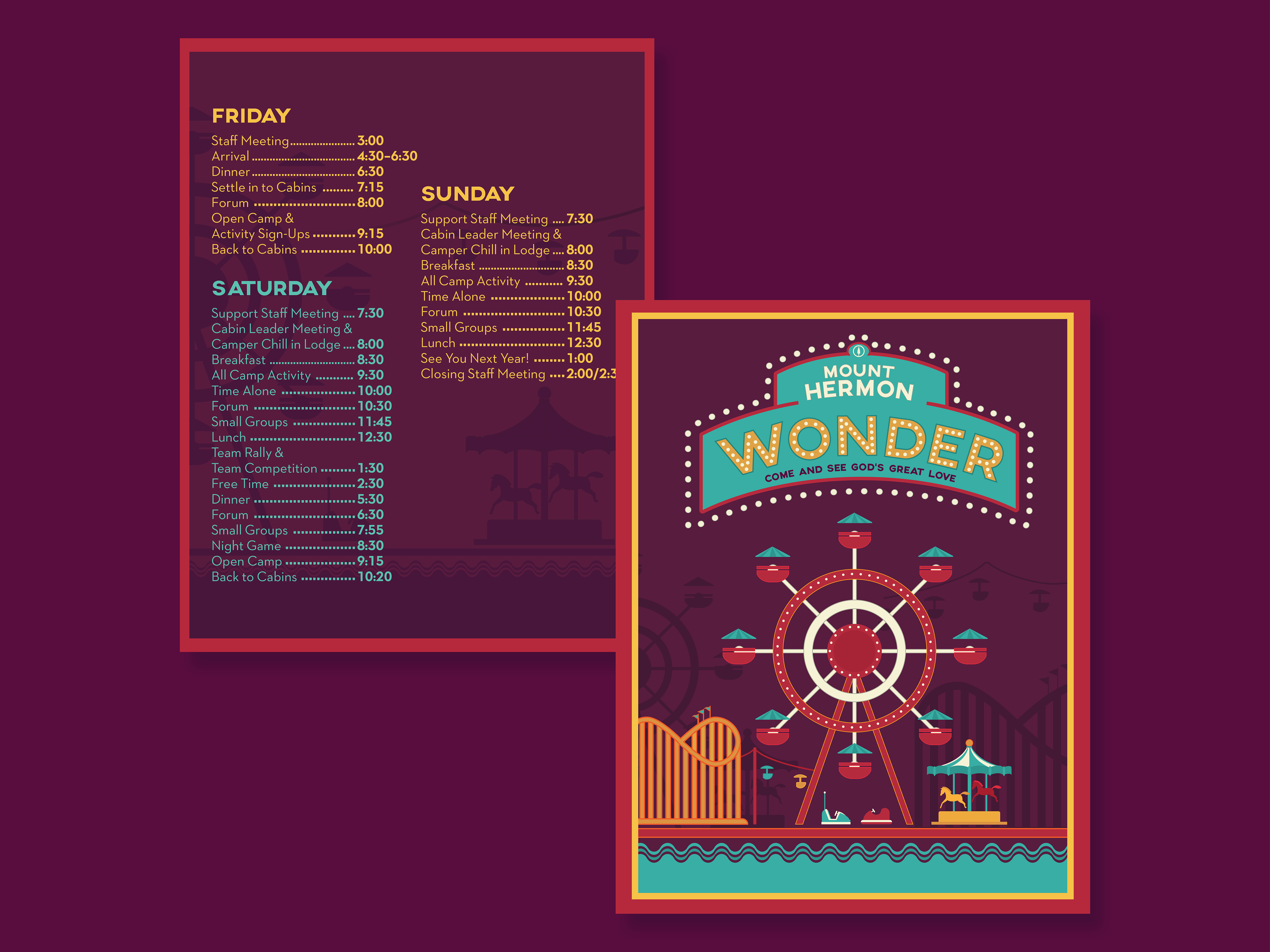
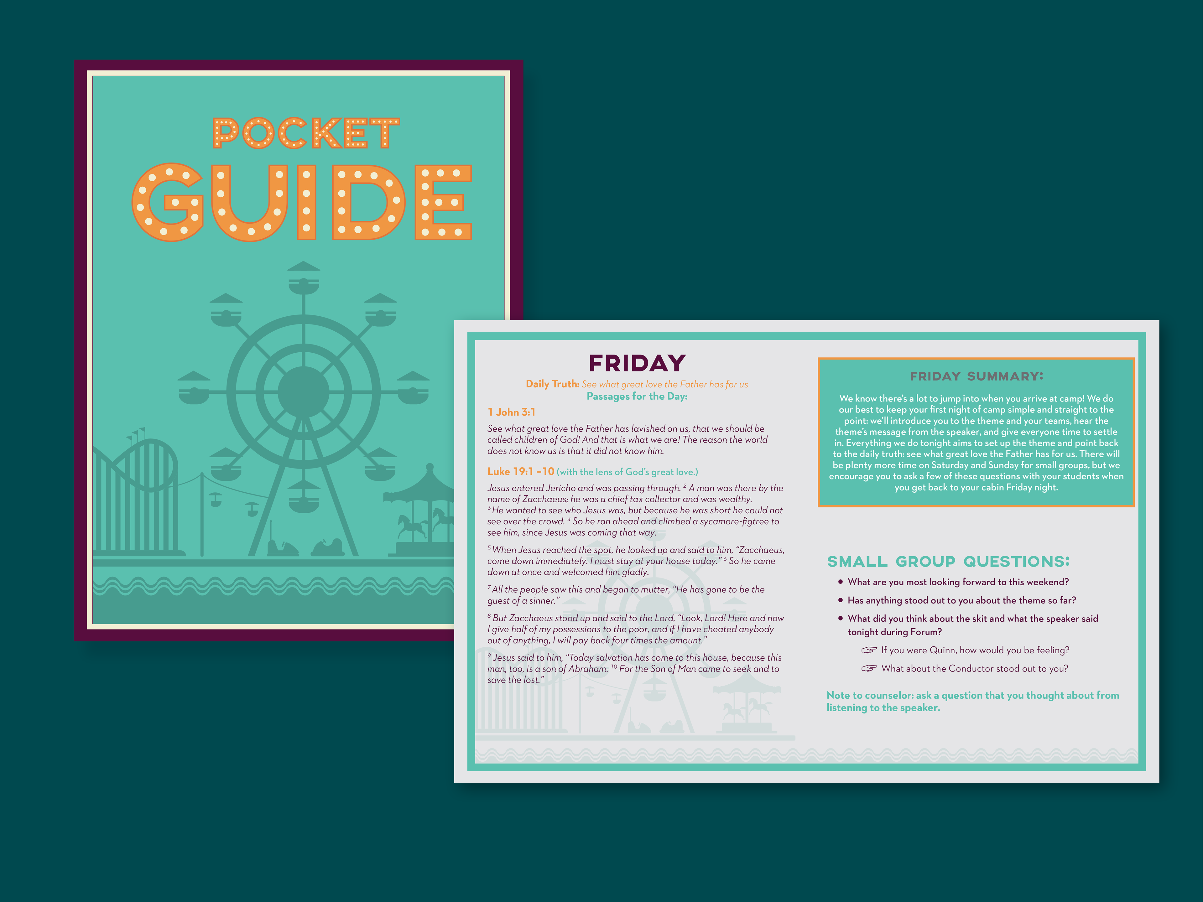
Schedules, Pocket Guides, Workbooks all worked together to continue the theme throughout all aspects of camp. Schedules were adapted from previous years to better fit in the pocket of a staff member for quick and easy reference since cell phone use is frowned upon.
Exploration
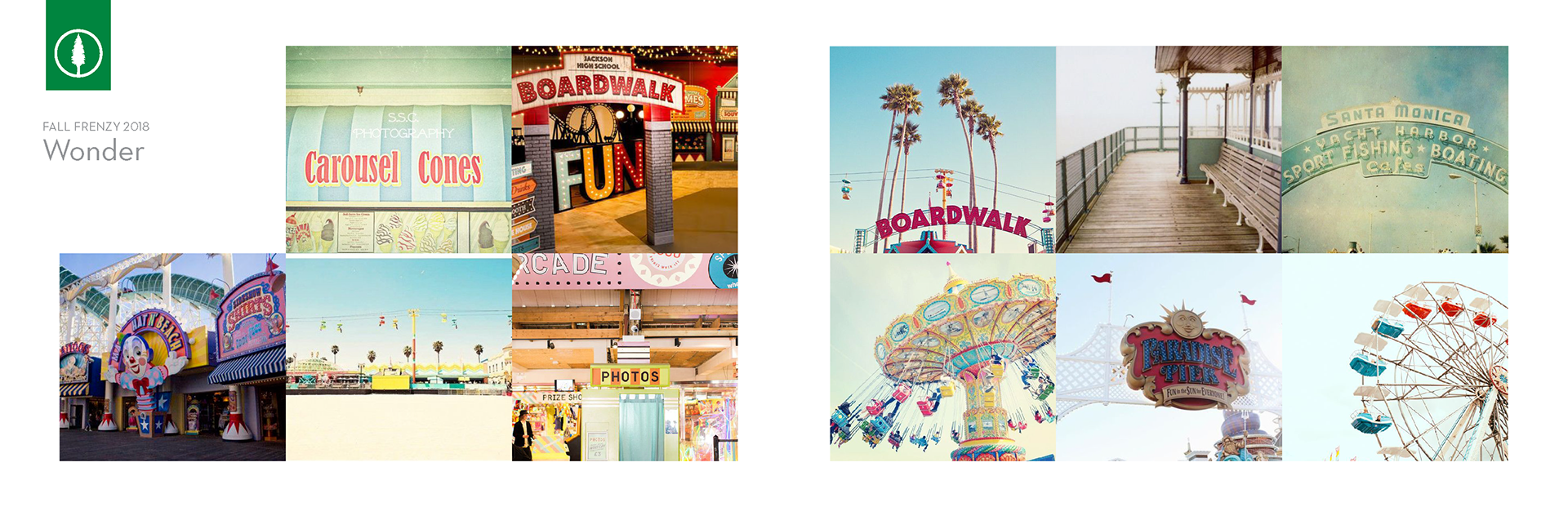
I explored the world and era of the boardwalk, digging into the simplest thing that could symbolize it and then circling back to its most iconic factors. What makes the environment and atmosphere of the Boardwalk so enticing and unique? How do you balance the onslaught of colors, sights, sounds, smells and narrow it down to one identifying thing?
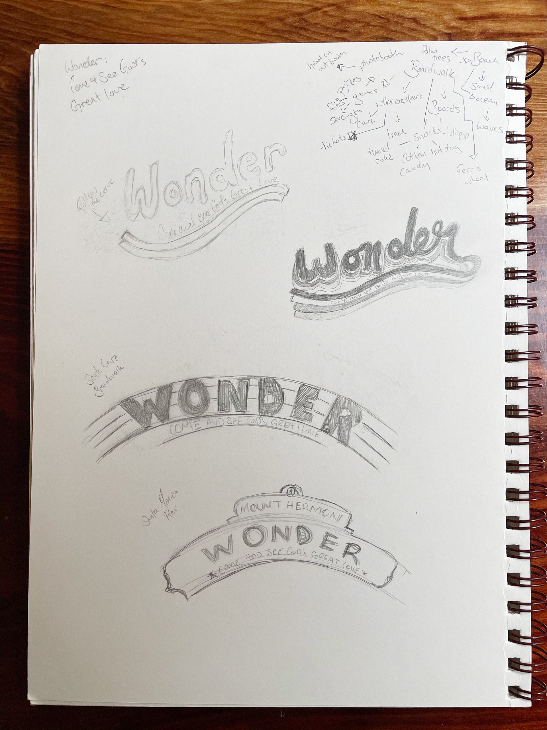
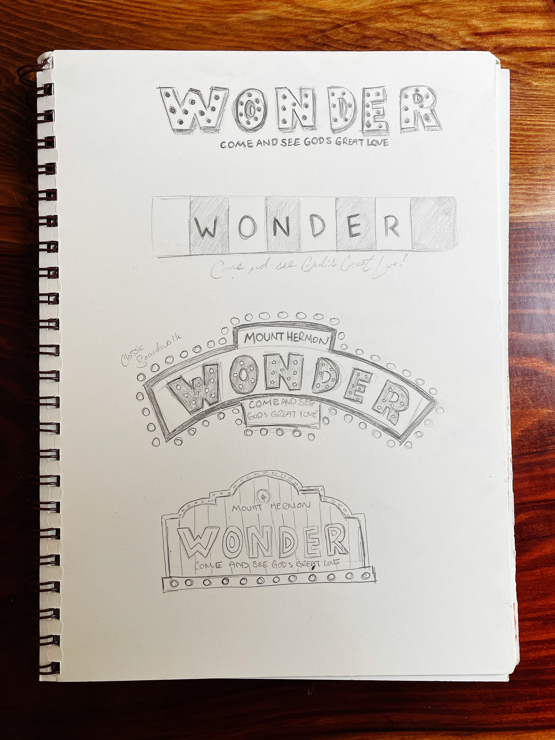
I take an analog approach to sketch out all directions the project can go in. The client can then weigh in on their choice before the process has gone too far.
To make sure the client and I are on the same page I create a proposed style guide with inspiration, ideas, sketches, and color palette options.
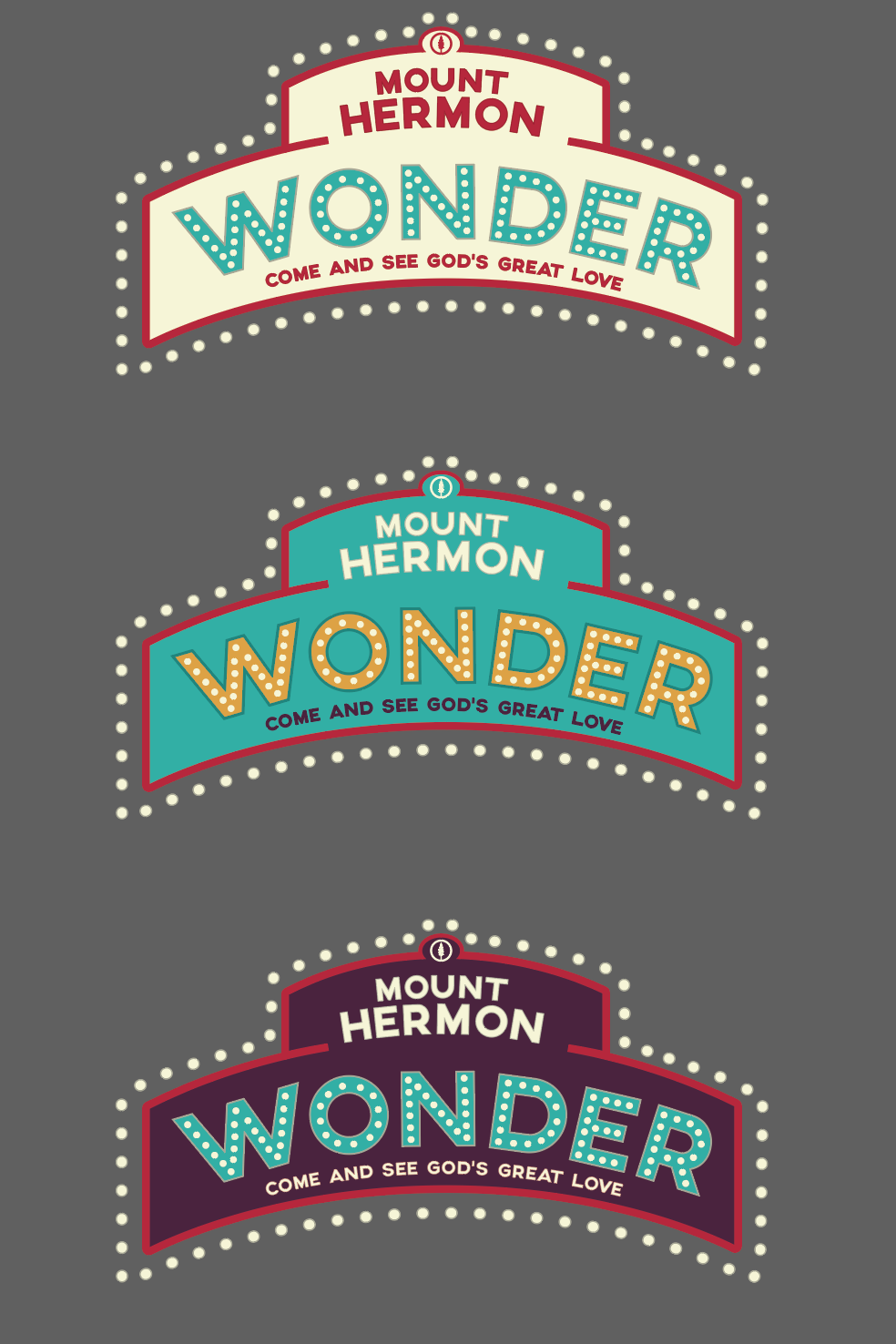
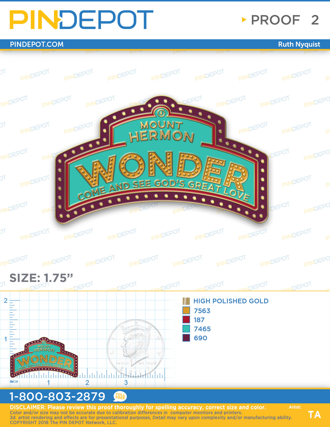
Moving forward the client is given color options with the logo they chose to see which one best fits the theme. Since these retreats happen during the winter months, the client decided to go with the brighter, more colorful option. The logo was then mocked up for use on pins (for student prizes) and staff garments.
Delivery
Our strategy centered on designing an experience that brought the world of the boardwalk to a retreat in the mountains. We captured the essence of the boardwalk to bring it to life through book material, decor, staff garments, giveaways, etc.
Key Takeaways
• Boiling down the essence of something into one key identifier
• Different ages can be drawn to different design styles, but there can be a balance
Results
• $1000's of dollars saved in decor, design time, and setup costs
• 2000+ students educated over the span of several weekend retreats
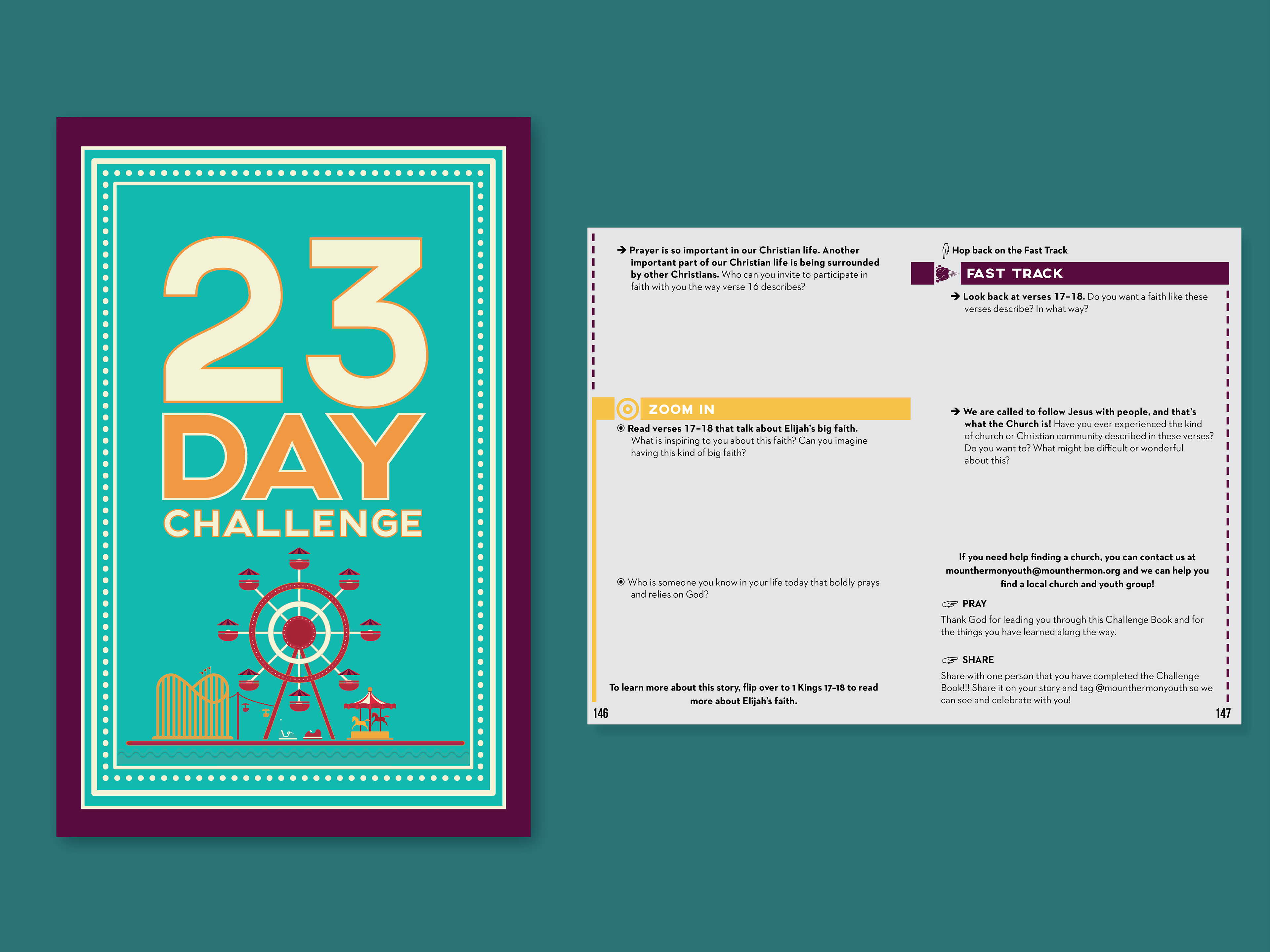
Students were given a workbook to take home and continue what they were learning at the retreat. Habits are formed after repeatedly doing something for 21 days; with that in mind, all workbooks are created to last 21 days or more. These workbooks were created with separate tracks within them that students of varying levels could complete. The symbols and borders communicated which track the student was currently on.